Case Study —Pink Papers
Designing a content system that got governments to
open doors.
My Contributions
Pink Papers was a content design initiative built to show governments how service design actually works, without the jargon, without the wall of text. My role was to take outlines and rough content direction and turn them into something people would actually read: a visual content system with its own brand, illustration style, and companion web experience.
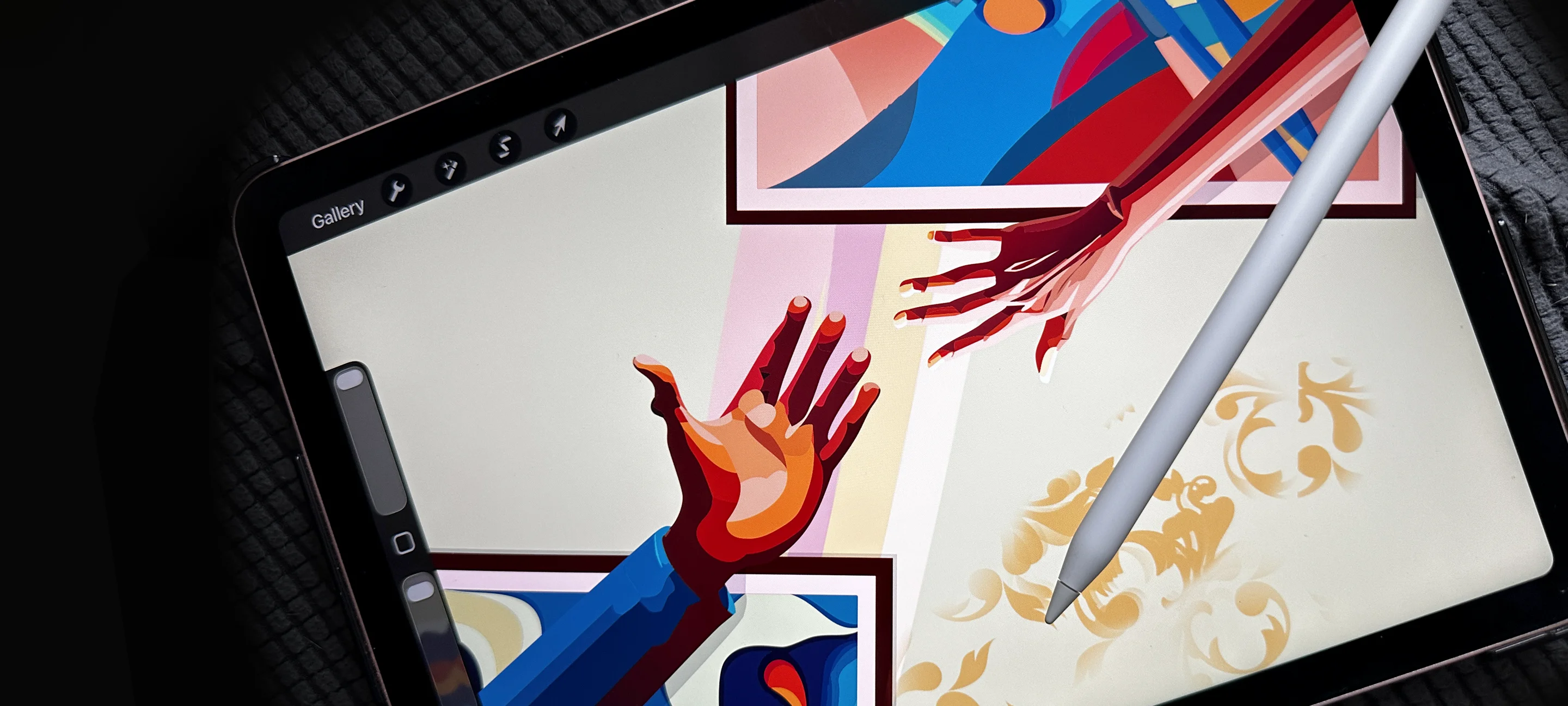
I concepted and drew the illustrations across the series, developing a bold, distinctive visual language that could carry complex policy ideas without making them feel bureaucratic. I designed the layout and visual system for each paper, and prototyped the parallax web versions in Framer that gave each topic a more digestible entry point before readers hit the full PDF.
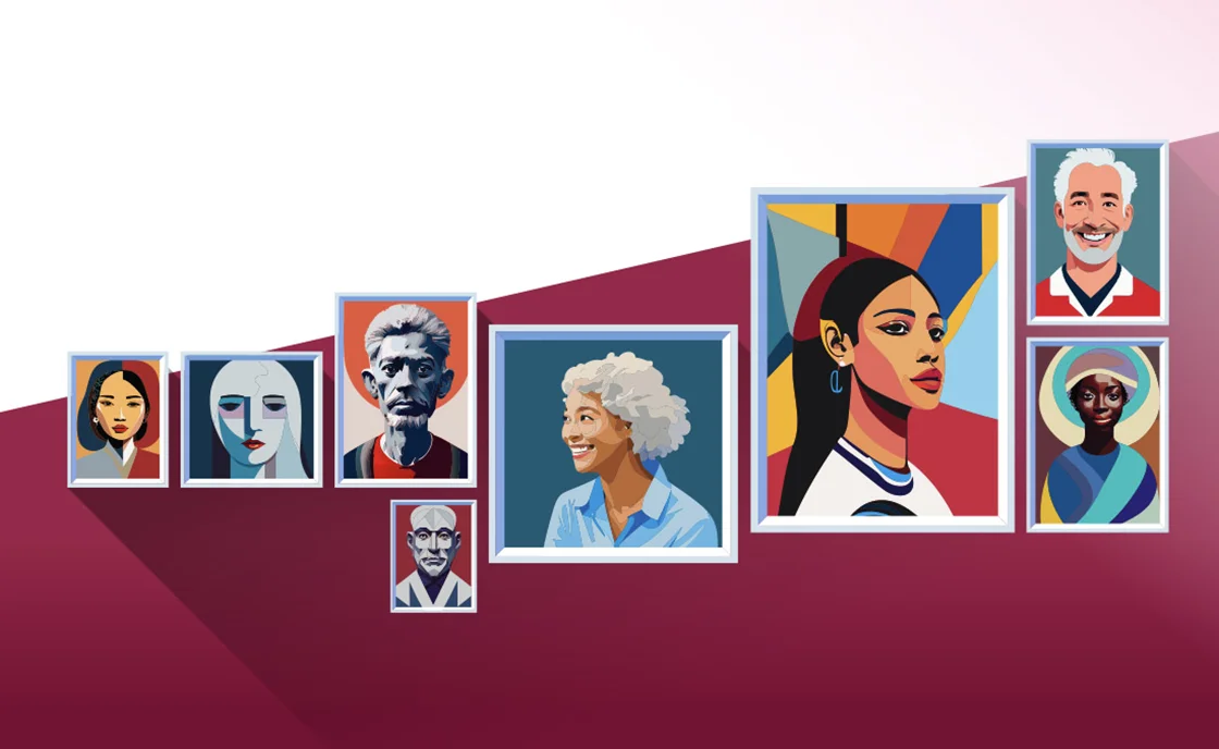
The illustration style ended up doing work beyond the papers themselves. It opened the door to commissions for other government-adjacent projects, including a series of illustrations for Status of Women Nova Scotia, proof that a well-considered visual identity can become its own business development tool.
Client: What We Make it →
Impact
A whitepaper series that became a visual identity, and a visual identity that became a lead generation engine.
Making policy readable
Government audiences are not a monolith. The Pink Papers were aimed at decision-makers, policy leads, and procurement teams, people with real authority but not necessarily deep familiarity with service design as a discipline. The challenge wasn't explaining what service design is. It was making the case compelling enough that they'd want to act on it. That meant the design had to do as much work as the words.

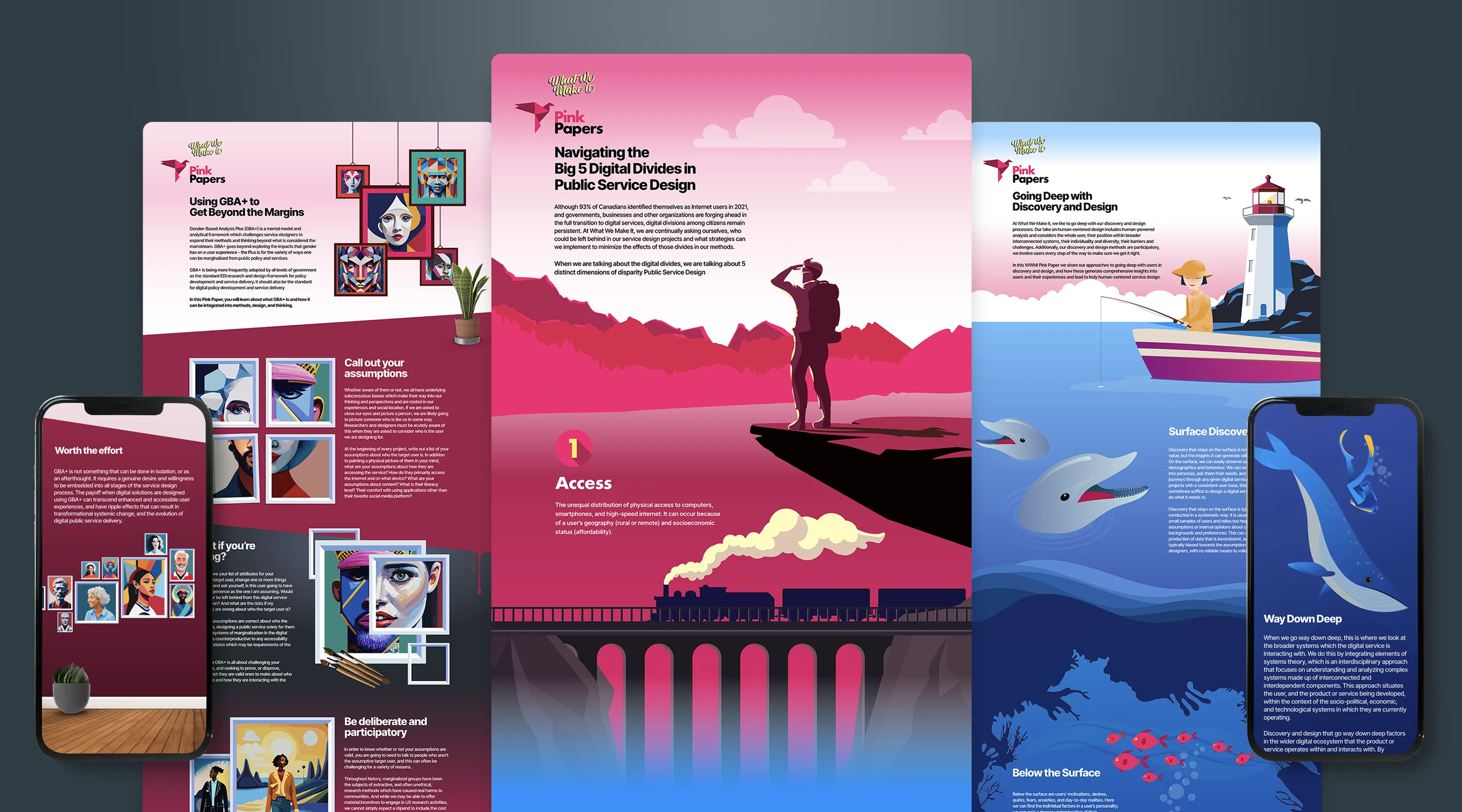
Illustration as a design system
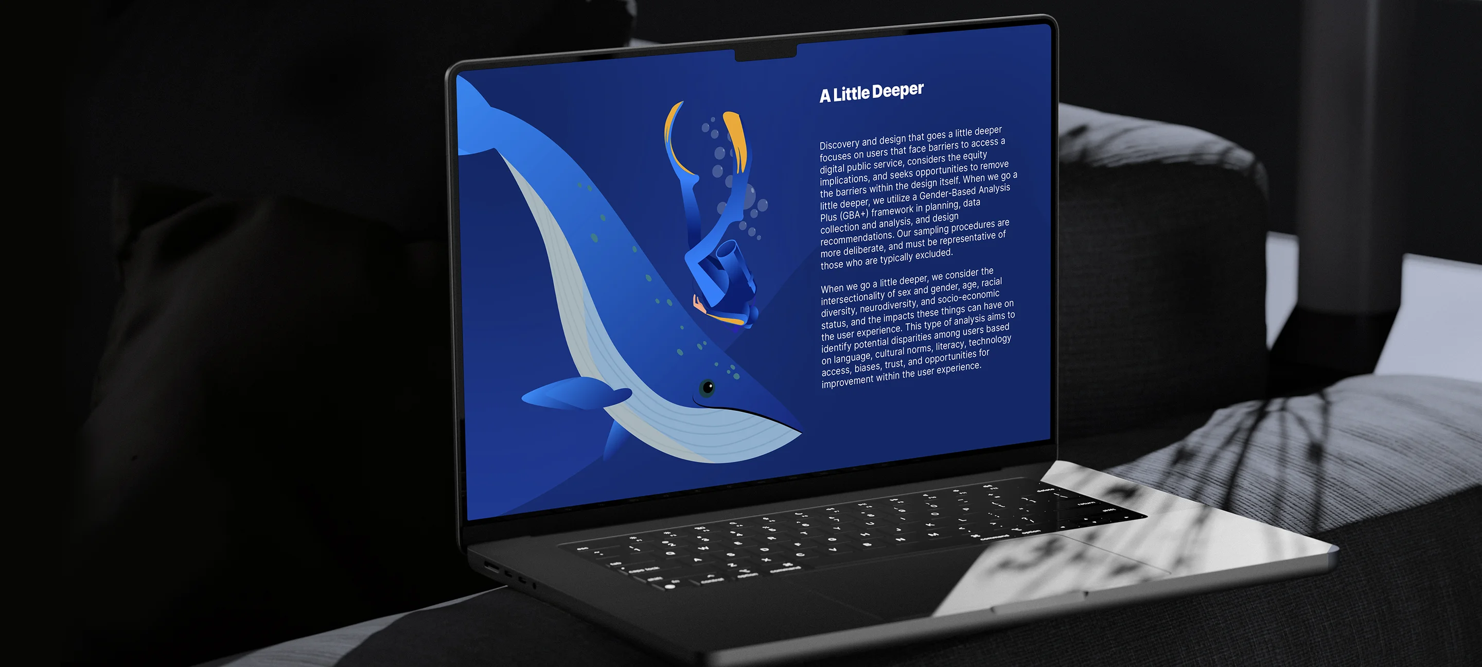
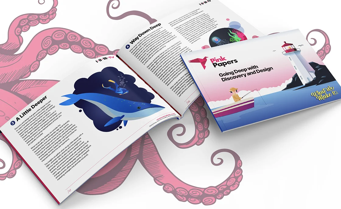
Most government whitepapers look like government whitepapers. The illustration direction for Pink Papers was a deliberate break from that. Bold, editorial, with a consistent colour palette and visual metaphor system that ran across the full series. Each paper had its own thematic imagery, but the style remained cohesive enough that the series read as a unified body of work rather than a collection of one-offs. The illustrations weren't decoration, they were the first signal that this content would be worth reading.


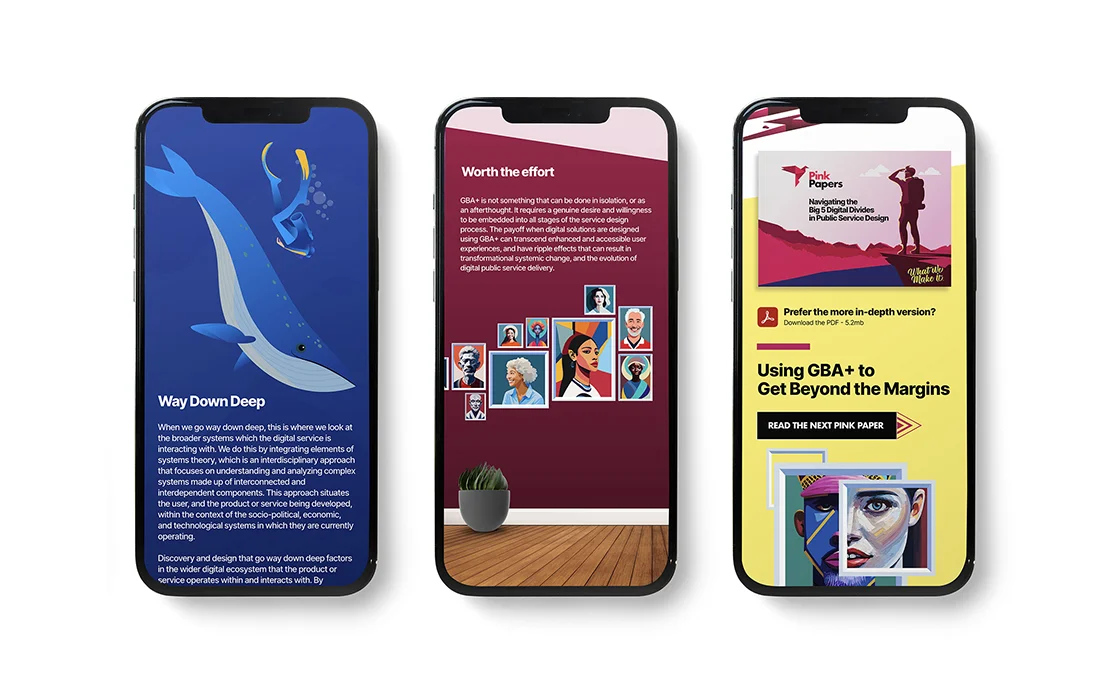
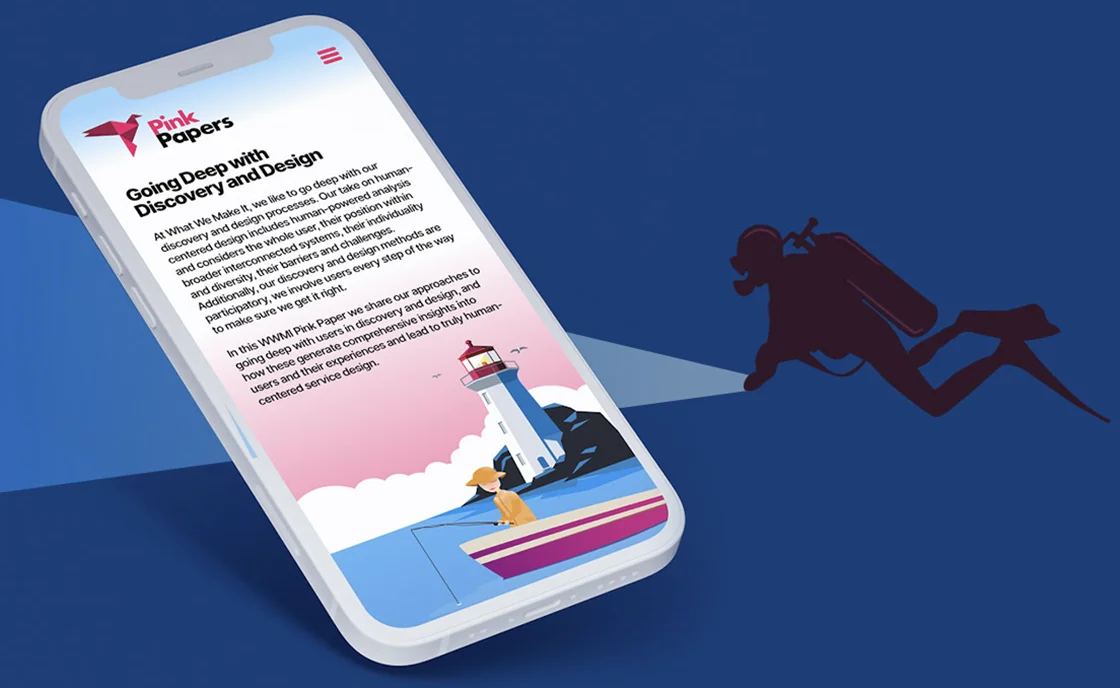
The web experience
Each paper had a parallax web companion, a more digestible, point-form version of the content designed to pull readers in before they committed to the full PDF. The web versions used the same visual language as the papers but were structured for scrolling rather than reading, with the key ideas surfaced up front and the illustration work given more room to breathe. The PDFs and the web pages worked as a system, not duplicates of each other.
Outcome
Three papers published, a fourth in progress. The visual system created for Pink Papers proved transferable, the illustration style resonated with government clients and led directly to new work outside the series, including illustrations for Status of Women Nova Scotia. What started as a content design project became a proof of concept: that design-led thinking could speak credibly to public sector audiences, and that a strong visual identity could open doors that a cold pitch rarely does.
A rare medium, well done.
Let's Talk.