Case Study — Eastlink
Bringing a legacy telecom into the self-serve era.
My Contributions
Eastlink had a real problem, a legacy site that was pushing customers to the phone instead of letting them help themselves. I came in as lead designer to fix that, working closely with back-end developers to make sure the UX we designed could actually be built.
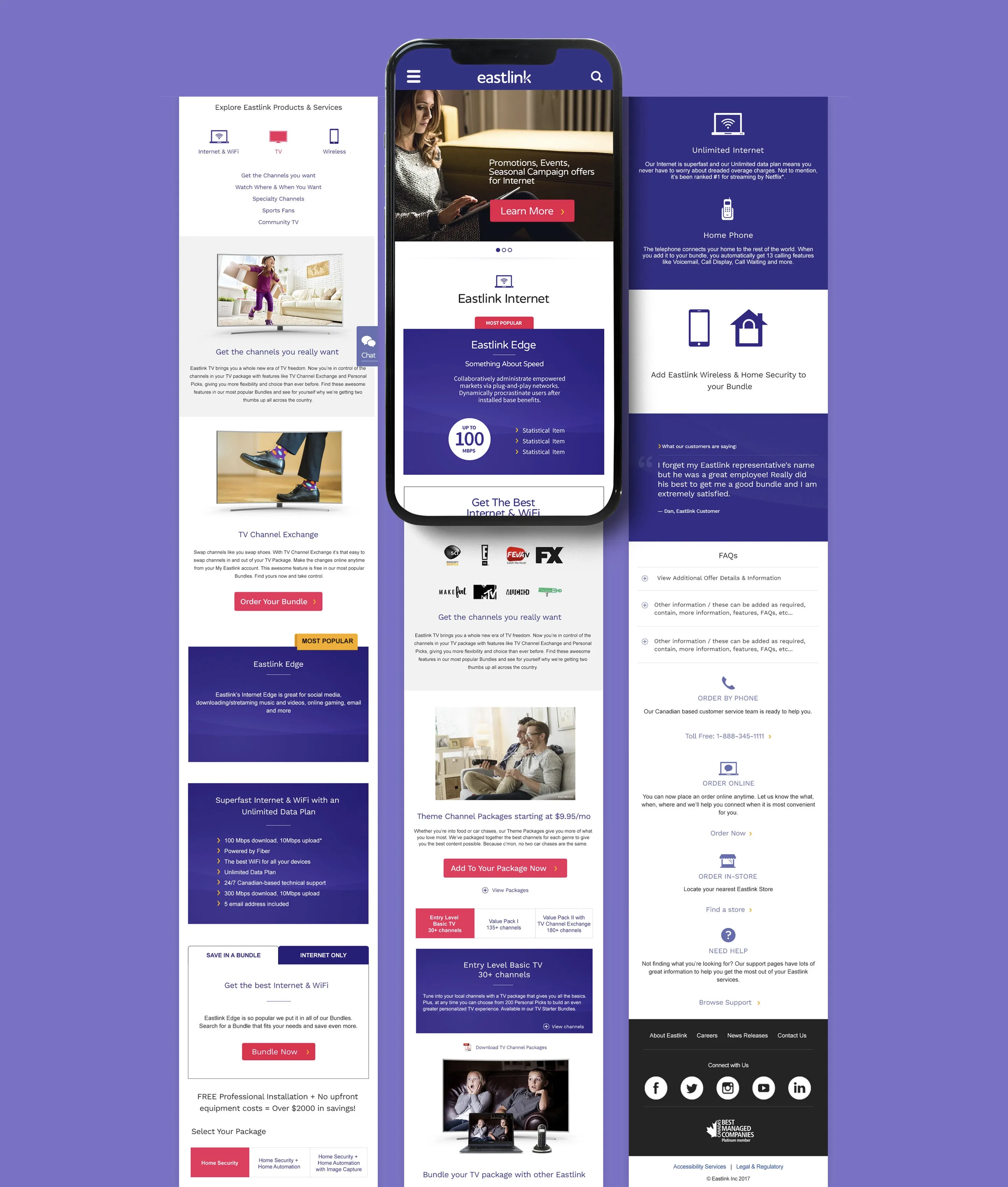
The core work was serviceability, building a postal code and location-based lookup that surfaced the right plans for the right addresses, cutting through the ambiguity that was driving people to call centres. Alongside that I introduced a reusable component library, which was still a fairly new concept for a regional telecom in 2017, and redesigned the key product and onboarding pages from the ground up.
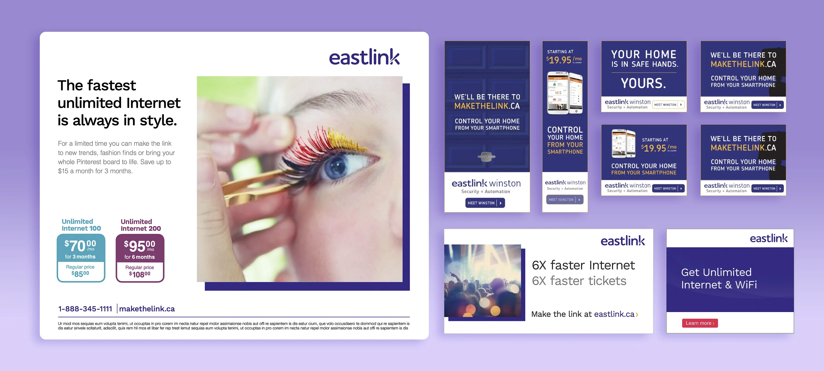
The engagement also included Google ad campaigns and landing pages, collaborating with a Agency on creative and digital advertising across the Atlantic market.
Impact
One of Atlantic Canada's largest telecoms, a legacy web presence, and a mandate to get customers off the phone and online.
Discovery
Before a single wireframe was drawn, we needed to understand how Eastlink's customers actually thought about their services, not how the business assumed they did. I led a series of in-person ideation and research sessions with stakeholders and users, mapping out pain points, mental models, and content priorities across the wall. That research directly shaped the IA and informed every product page that followed.
Information Architecture
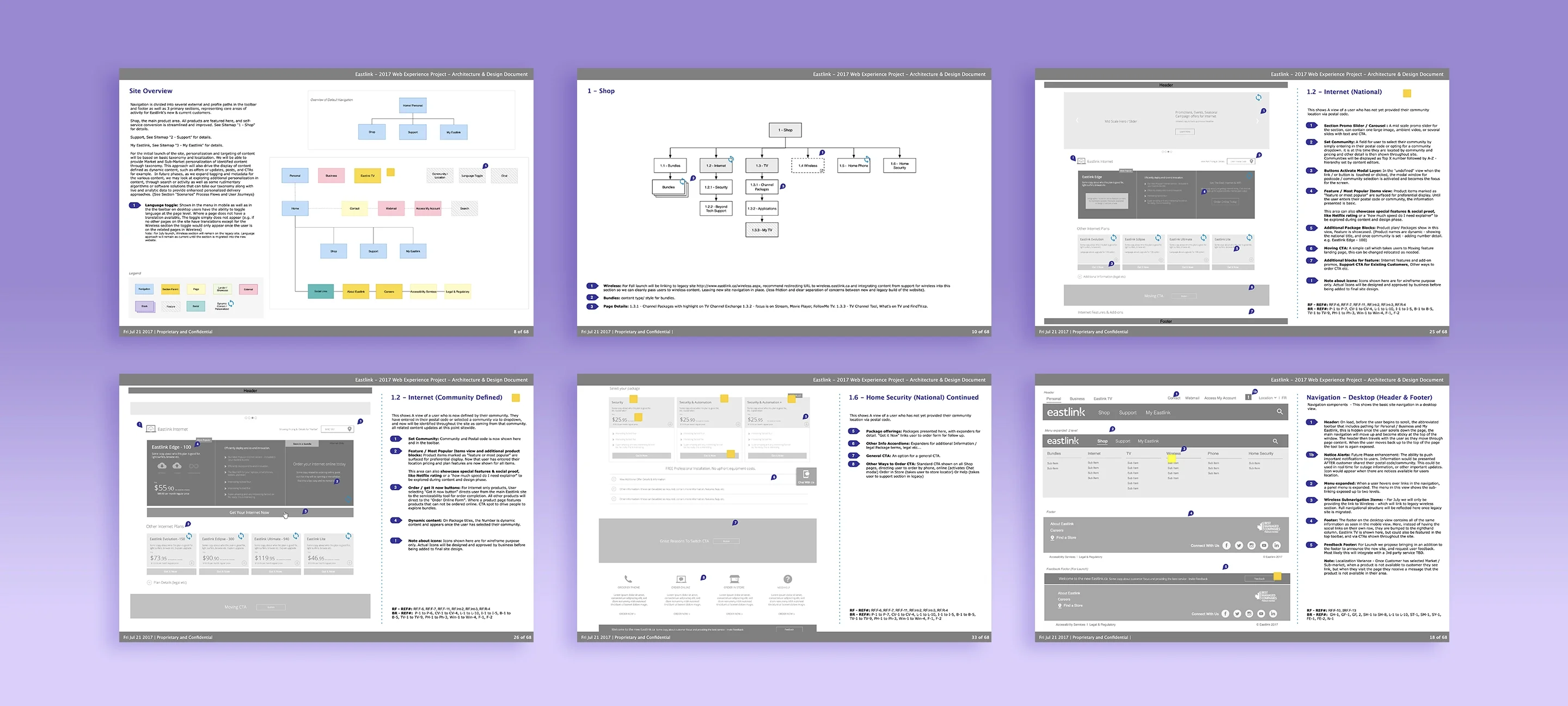
With research in hand, I built out the full site architecture solo, a national site spanning five primary sections, six product categories, localization by postal code, self-serve account access, and Eastlink TV as its own destination. Every page had a purpose, every user path had an owner. The IA had to account for community-level content variants, authenticated vs. unauthenticated states, and a phased launch that kept the wireless section on the legacy system while the rest went live.
Design
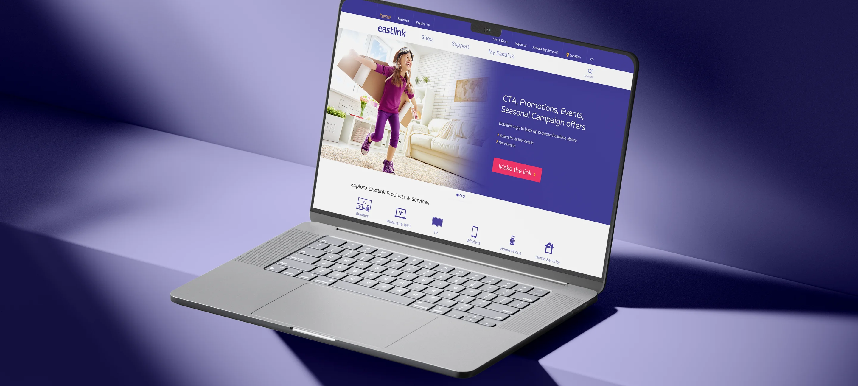
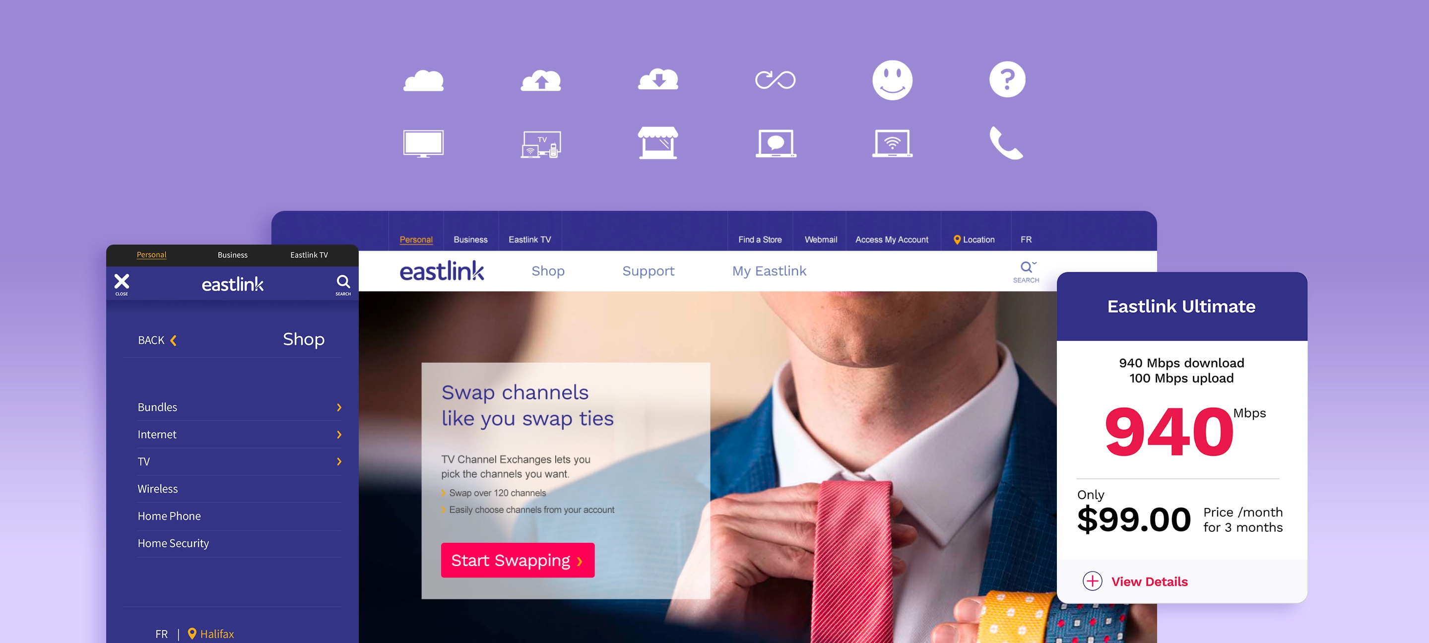
With the architecture locked, I moved into visual design, translating the wireframes into a fully realized UI system for eastlink.ca. Every product page, landing template, navigation state, and form was designed from scratch. The challenge was building something that felt modern and consumer-friendly while carrying the weight of a complex product catalogue across multiple regions. Clean hierarchy, clear conversion paths, and a component-based approach that the development team could actually build from.
Components
One of the more forward-thinking parts of the project was building a proper component library, early for a regional telecom in 2017. Rather than designing one-off pages, I established a reusable system of UI patterns: carousels, product cards, accordions, CTAs, form elements, navigation states, and promotional blocks. This gave the content team the flexibility to build and update pages without breaking the design, and gave the dev team a consistent foundation to build on.
Advertising
Beyond the site itself, I led the design of Eastlink's digital campaigns, landing pages, and direct mail. While agency support was nominally in place, the creative direction and execution was largely mine. The work spanned Google ad campaigns, promotional landing pages tied to community-specific offers, and print mailers, all designed to drive traffic into the new self-serve conversion funnel.
A rare medium, well done.
Let's Talk.