Case Study — Vidcruiter
Designing the product and brand behind a bootstrapped hiring revolution.
My Contributions
Embedded within the founding team, I owned all design end to end, from initial stakeholder sessions with data scientists and agronomists through to investor-ready prototypes and pitch materials. This wasn't a hand-me-a-brief engagement. I was in the room where the product was being figured out, translating complex satellite imagery analysis and AI risk modelling into something farmers could trust and insurance executives could sell.
My work spanned brand identity, UX research, user flows, journey mapping, full app UI design, interactive prototyping, pitch and investor decks, and the website.
Impact
One designer, two years, and a product that helped reshape how the world hires.
Discovery
Joining a fast-growing company with no coherent design foundation, I quickly found a product and brand built from years of disconnected freelance work, inconsistent UI, no design system, and a visual identity that varied from page to page. The opportunity was clear: this wasn't just a UX role, it was a chance to build everything properly from the ground up. I immersed myself in the product, the brand, the users, and the business goals before putting pen to paper.
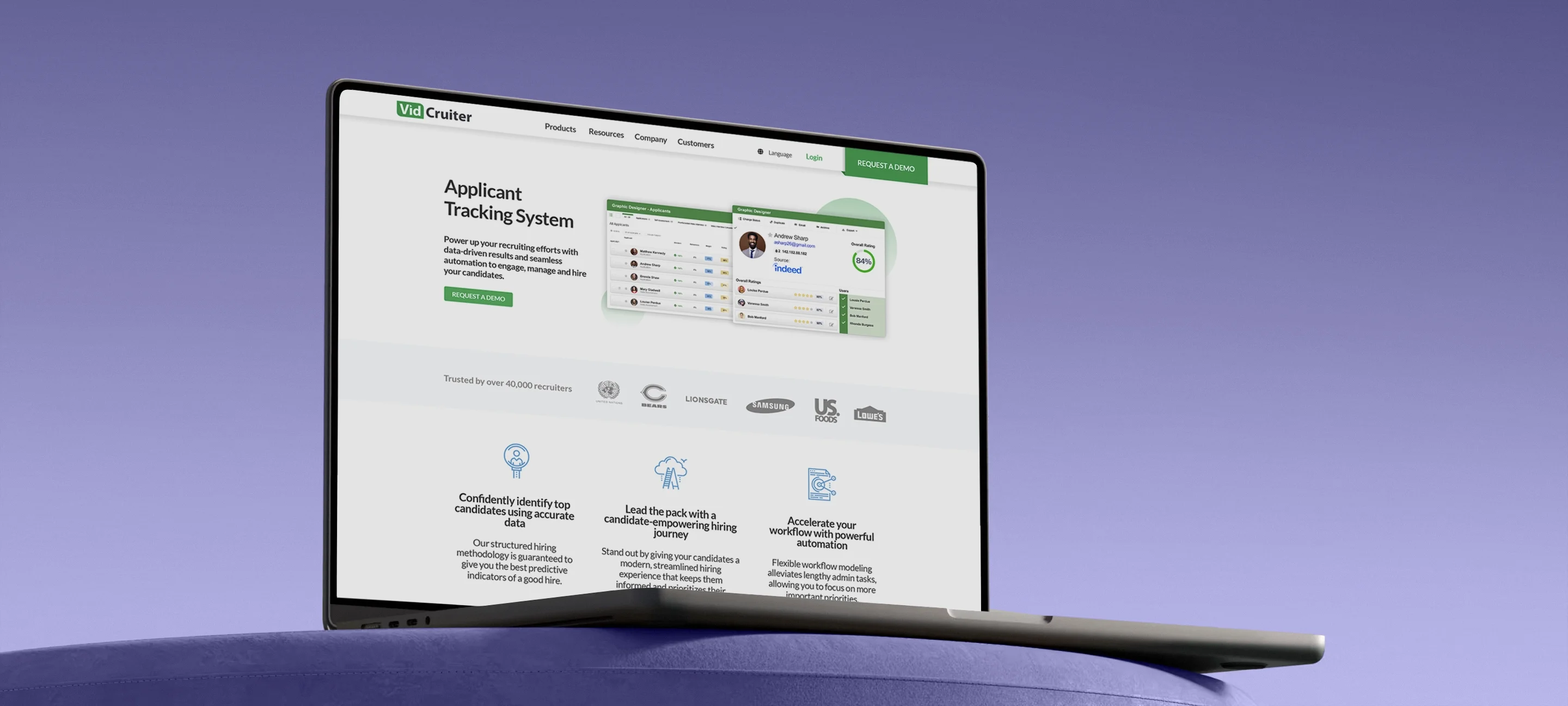
Rebrand and Visual Identity
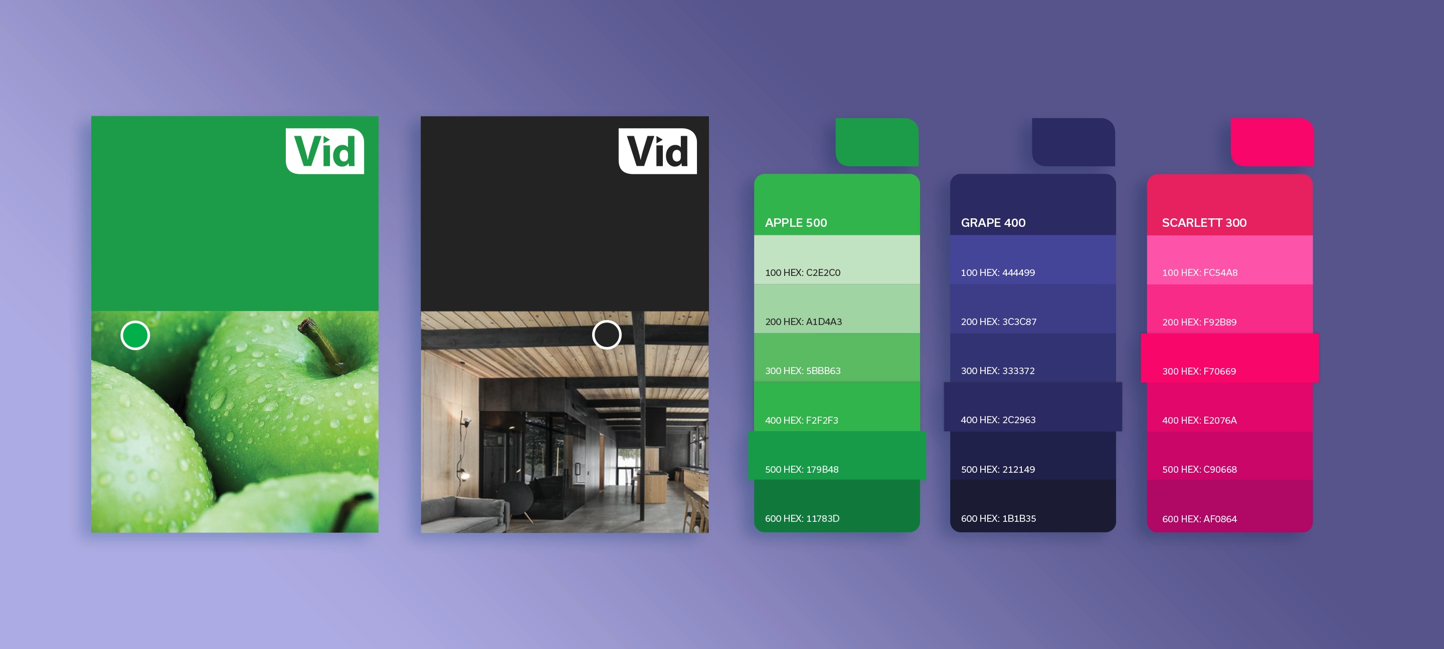
The existing brand was a collection of disconnected greens with no system, no consistency, and no personality. Rather than starting from zero, I evolved what existed, retaining green as a nod to the brand's roots but building a proper design language around it. The result was a three-colour brand system, Apple, Grape, and Scarlett, each with a full tonal scale, supported by a structured background palette of Night, Grey, and Ocean. For the first time, every designer, developer, and marketer was working from the same foundation.
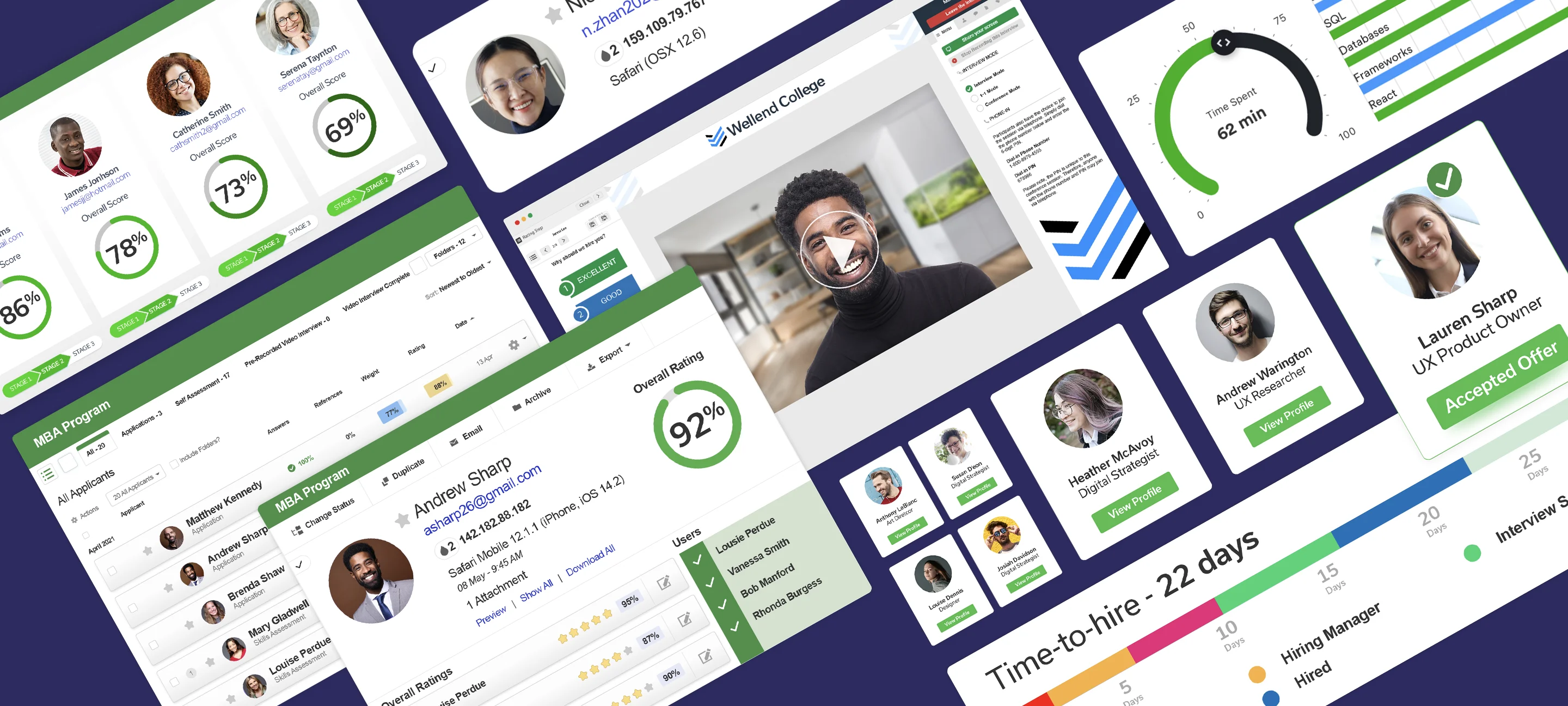
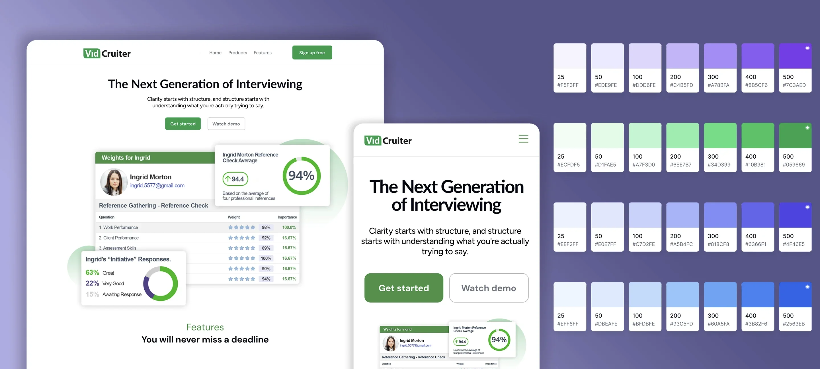
Design System and Component Library
With the brand foundation in place, I built a component library to bring consistency across every touchpoint. Clean, modular components covering layout, typography, CTAs, and imagery that flowed directly into mailers, web emails, and landing pages. A new font and refined CTA colour system tied everything together, and a redesigned mega menu footer gave the site a more structured, professional feel. Marketing could now build new pages independently and confidently, without every asset needing to come back through design.
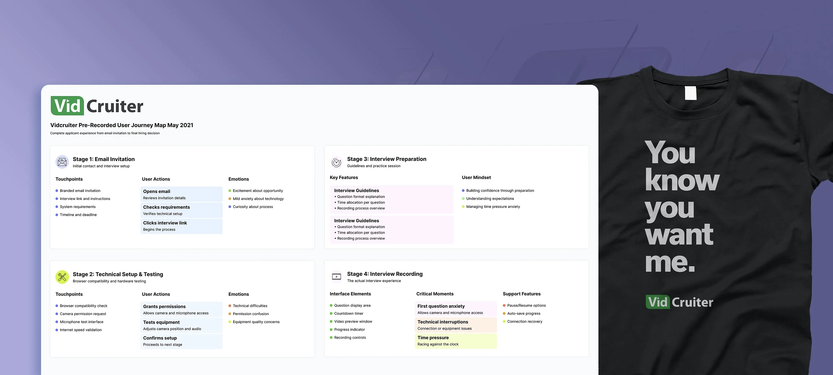
Onboarding Redesign
With a 45% applicant dropout rate creating a flood of support calls the team couldn't handle, I started where every good UX process should, by using the product myself. The problems were immediately clear. Camera and microphone testing was buried, error messaging was cold and unhelpful, the platform only functioned in Chrome with no guidance for users on other browsers, and there was nowhere to turn when something went wrong.
The redesign tackled all of it. Hardware testing was surfaced early and made intuitive. Messaging was rewritten from engineer-speak into something human, reassuring, and occasionally a little cheeky. Contextual tooltips and an accessible troubleshooting library gave applicants the confidence to solve problems themselves. The result was a 60%+ reduction in dropout rate and a significant drop in support call volume, freeing the team to focus on growth rather than firefighting.
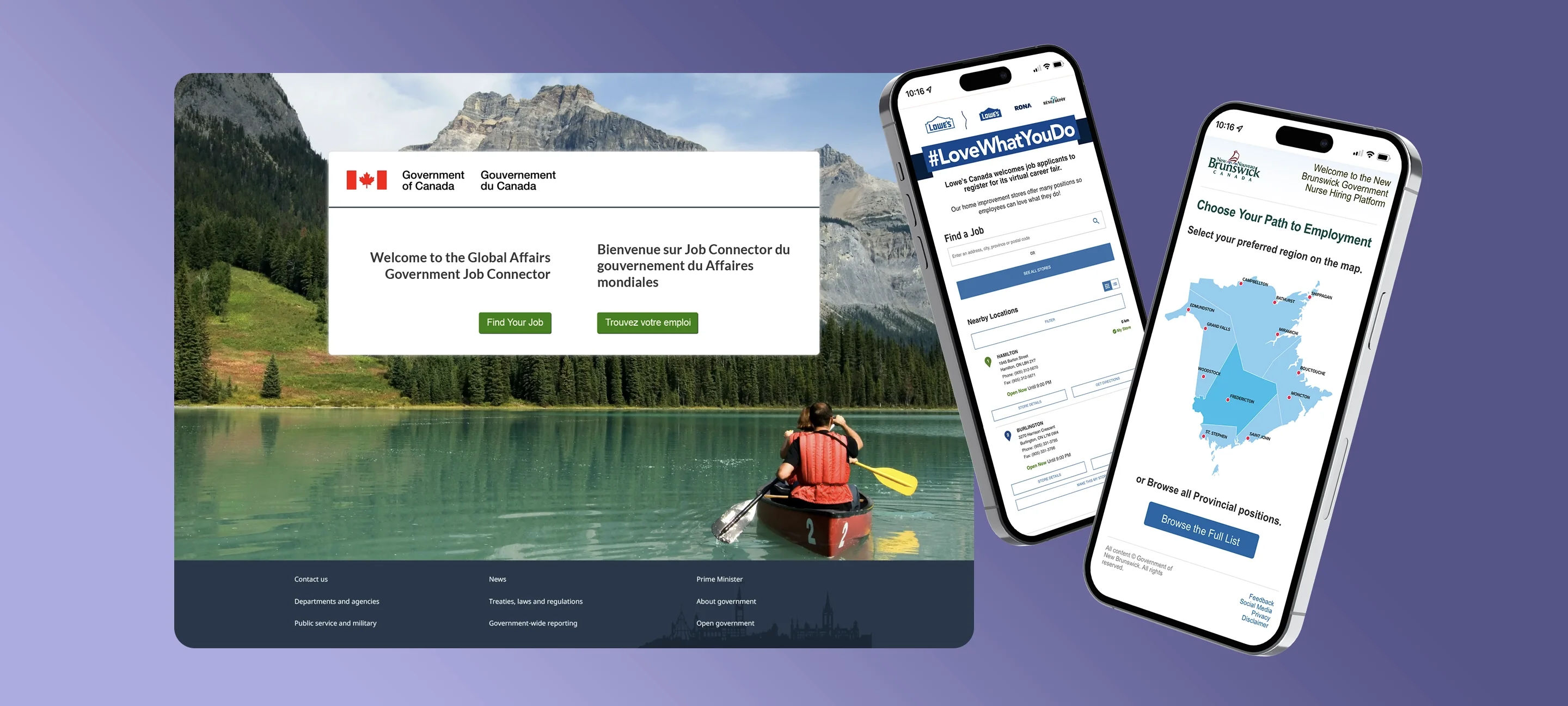
Enterprise Client Sites
Beyond the core product, I designed and built custom job fair and hiring sites for enterprise clients, each fully branded to their own identity and audience. From the bilingual Government of Canada Global Affairs Job Connector to the Province of New Brunswick Nurse Hiring Platform to gig worker recruitment for Delivery Logistics, every site was built from scratch around a shared core, giving candidates a direct line to apply, communicate with the platform, or connect with a human recruiter right in the browser. Clients came back repeatedly, which was the only measure of success that mattered.
Outcome
Three years, one designer, and a company that grew from 25 people to over 220. The rebrand, design system, and component library became the foundation everything was built on. The onboarding redesign turned a 45% dropout crisis into a 60%+ improvement and freed the support team to focus on growth. Enterprise clients kept coming back. Revenue grew 62% in a single year.
VidCruiter didn't just grow during one of the most disruptive periods in hiring history, it thrived. And the design was a big part of why.
A rare medium, well done.
Let's Talk.